|
 |
|

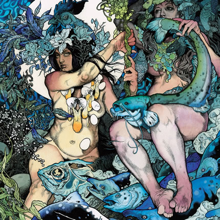
Baroness - The Blue Album : The creation of this drawing of two goddesses of fertility, or whatever these women may portray, must have taken several days, maybe even weeks. The level of detail is astonishing. I especially like the floral arrangements (that remind me of Alphonse Mucha) and the way he did hands and feet. Hands and feet, as any illustrator or painter will tell you, are the most difficult parts of the human body. His cold and nearly monotone use of colour is very beautiful as well.
http://aperfectmonster.com |
|
| |
|
|
 |
|
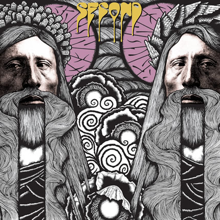
Baroness - Second (EP) : Same artist and just as good, only here his approach reminds me of those big Gilbert & George posters, but with a more subdued use of colours. It could also have been a design for a modern stain glass window.
http://aperfectmonster.com |
| |
|
|
 |
|
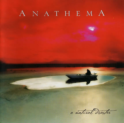
Anathema - A Natural Disaster : I don't know what technique was used here. It could just as easily be a photoshopped photograph as an oil or acrylic painting. Whatever it is, the horizontal composition of bands of contrasting colours, the faint shimmering lights in the sky, in the water and on the ground and the dark line on the horizon give this image a Mark Rothko'esque appeal. Indeed, you could look at this as an abstract minimalist painting. In that case the boat and its occupant becomes just an added narrative element to help you make sense of the CD's title, and to evoce a feeling of desperation. The calligraphy of the words 'a natural disaster' is very nice as well. |
| |
|
|
 |
|
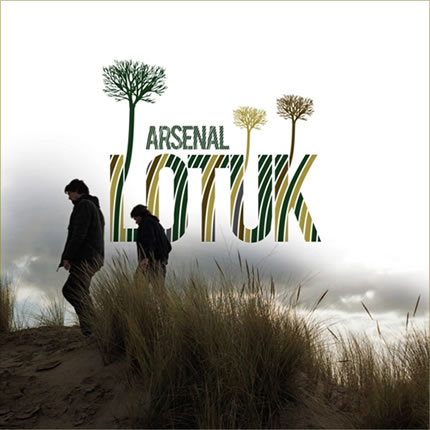
Arsenal - Lotuk : A good sense of balance and the smart use of subdued colours makes this compostion of a photograph and a few vector based elements very easy on a graphic designer's eyes. Looks simple, yet you need experience and the heart of an artist to turn a seemingly banal scene like this into visual poetry. |
| |
|
|
 |
|
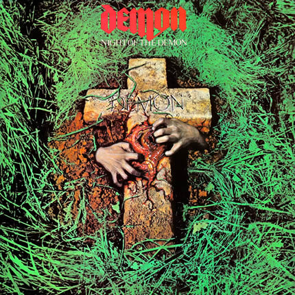
Demon - Night of the Demon : I don't know why the stone cross has entrails, but for some reason this image stayed inside my head as one of the strongest ever to come from the NWOBHM scene. Call it nostalgia if you want, but I still like it. |
| |
|
|
 |
|
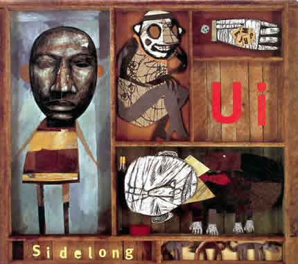
Ui - Sidelong : A very fine use of mixed media and very much in sync with the alternative music of the band. |
| |
|
|
 |
|
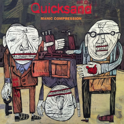
Quicksand - Manic Compression : Looks like a combination of a painting technique and some sort of wood-block printing technique. I'd like to know how he gets to this result. Whatever it is, I like this kind of quirky artwork. Reminds me of my time in art school. Very nice. |
| |
|
|
 |
|
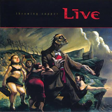
Live - Throwing Copper : Live cheated. They simply took an existing image and used it for their CD. It's a paining by Scottish artist Peter Howson titled 'Sisters of Mercy'. An impressive choice for it uses the depth of the ancient technique of oil painting in a more contemporary style. The light, the volumes, the colours and the exaggerated human shapes and their dramatic poses make this one of the most expressive paintings I ever saw. |
| |
|
|
 |
|
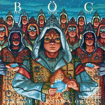
Blue Öyster Cult - Fire of Unknown Origin : Greg Scott does a very fine job at evocing a feeling of weird mysticism. This image is especially impressive in its choice of colours and in the level of detail in the character's clothes. Few Hard Rock albums have art work better than this (or maybe none) but unfortunately you lose a lot of the image's impact if you only have a CD version of the album. The subtle nuances of the colours also make it very difficult to properly reproduce the image for on-screen display. It works best at larger sizes and in a printed format. |
| |
|
|
 |
|
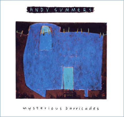
Andy Summers - Mysterious Barricades : Not a very inventive lay out, but I like the semi-abstract painting with its field of translucent blue against a dark background. |
| |
|
|
 |
|
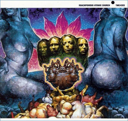
Roachpowder - Atomic Church : Normally I'm not that interested by artwork that displays the faces of the musicians, but in this case it's done in an original way. The artist's technique is so impressive I couldn't help but being marvelled by it. It seems to be referring to the psychedelic art of the seventies, but it does so in a dark and negative manner. The message is clear: Roachpowder wants to shock you and to that effect they portray themselves as mysoginistic bastards. Women and pigs are piled up like pieces of meat as offerings to the hateful idols they are. Pure evil has rarely looked this convincing. |
| |
|
|
 |
|
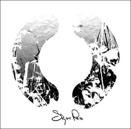
Sigur Ros - ( ) : A minimalist design like this one can have an instant appeal. |
| |
|
|
| < Previous 12 image | Next 12 images > |