|
 |
|
As a designer and illustrator as well as a music fan, I have always had a keen interest in sleeve artwork. In the past, when albums came as slabs of vinyl 30 centimeters across, designers could endulge themselves in fine details and subtle textures. In fact, the format of the CD did some of that earlier art in, as it translated badly to smaller sizes.
These pages show album and CD art that impressed me. Emphasis is on illustration, painting and fantasy art, three areas that interest me for semi-professional reasons. Photography isn't as present as it should be.
The rights of these images are owned by the artists or their record companies.

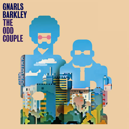
Gnarls Barkley - The Odd Couple : Fresh and suprising vector based design. |
|
| |
|
|
 |
|
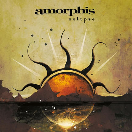
Amorphis - Eclipse : The simple composition puts all the emphasis on an expressive use of textures. It's nothing less than awe inspiring. |
| |
|
|
 |
|
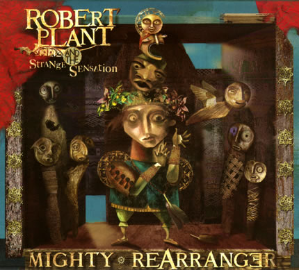
Robert Plant and the Strange Sensation - Mighty Rearranger : This illustrator has personality to spare. His style is recognisable, rich and detailed. Very inspiring. |
| |
|
|
 |
|
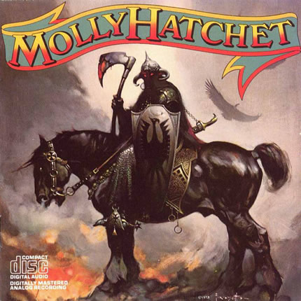
Molly Hatchet - Molly Hatchet : I never understood Molly Hatchet's choice of artwork. It just doesn't fit the Southern Rock they play. Maybe they were just fans of Fantasy Art. If so, at least they knew where to get the best of quality because you can't get much better than Frank Frazetta. His expressive brush strokes are deadly accurate and his knowledge of the musculature of both human and animal is perfect.
Here you see his 'Death Dealer', a character that would later become the main character of a Glenn Danzig sponsored Fantasy comic. The image is very static, helping to evocate a feeling of impending doom. The Death Dealer doesn't even have to act. He simply has to be. |
| |
|
|
 |
|
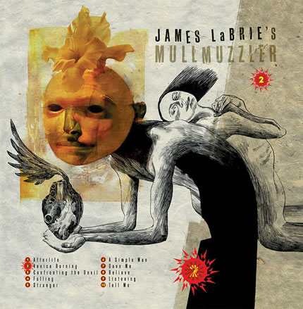
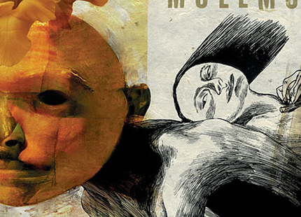
Mullmuzzler - 2 : An example of mastery of photo image composition techniques, the paint brush and the pen. Damn, this is strong stuff, even though the orchid in the image is a bit flat in comparison with the rest.
Below: a detail.
Dave McKean is a grandmaster. The image you see here is just the tip of the iceberg, so head on over to his site if you'd like to know more: http://www.mckean-art.co.uk/ |
| |
|
|
 |
|
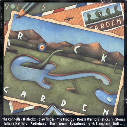
Rock Garden 3 (sampler) : No selection of illustrations could ever be complete without at least one sample of one of Belgium's best and most succesful illustrators. Now mainly an illustrator of children's books, Tom Schamp also did quite a few CD covers. What I like about this particular image is is the subtle, aquarel like technique that gives this image a retro feel. And of course, Schamp's unmistakeable personal style.
http://www.tomschamp.com |
| |
|
|
 |
|
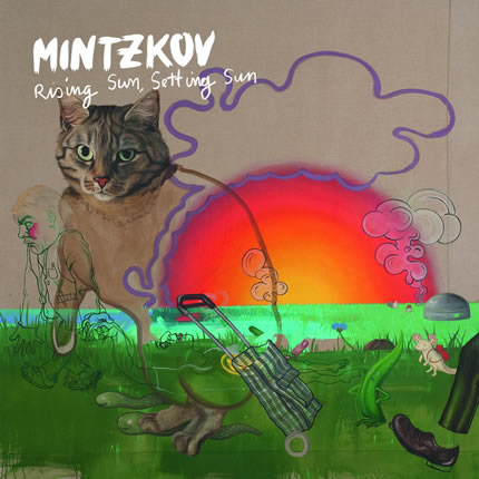
Mintzkov: Rising Sun, Setting Sun : The photorealistic cat's head, the seemingly amateuristic elements in the foreground, the weird superimposed elements in different styles, the colour palet,... If you think about it, this shouldn't work together at all. Yet it does. A daring and original piece of art. |
| |
|
|
 |
|
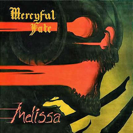
Mercyful Fate - Melissa : Skulls. They are such a cliché in the Heavy Metal genre that a strong image like this one comes as a surprise. The monotone very dark painting is highlighted by smears of red light that suggest movement. At the same time they are an indication of the skull's hellish origins. The artwork and band's music are very much in sync in this case. |
| |
|
|
 |
|
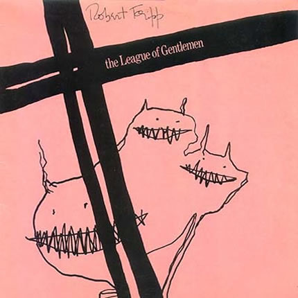
Robert Fripp and the League of Gentlemen - God Save the King : What more does a genuine artist need than a few lines and scribbles to create a strong compostion and an original image? |
| |
|
|
 |
|
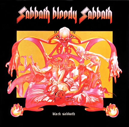
Black Sabbath - Sabbath Bloody Sabbath : What's even stronger about this image than the display of perfect anatomical knowledge and the drapings of the bed sheets, is the limited and subtle colour palet that only consists of pastel reds, pinks and yellows. It looks like a psychedelic, solarized image, yet it's all done by hand. Unfortunately this sleeve translates badly to the screen. You'd have to own the original album to appreciate it to the full. |
| |
|
|
 |
|
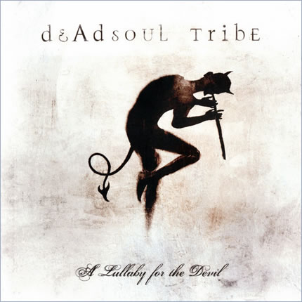
Deadsoul Tribe - A Lullaby for the Devil : The artist who created this image is a master of understatement. Simply beautiful. |
| |
|
|
 |
|
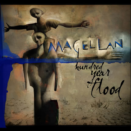
Magellan - Hundred Year Flood : A jawdropping impressive piece of art. The bronze colours work perfectly well with the blue accents. And just look at those highlights and shadows that bring out the band's name. In fact, this image is perfect in every aspect as far as I'm concerned. |
| |
|
|
| Next 12 images > |